The Fine Line Between Comfort and FitOctober 25, 2024 There's a fine line between Comfort and Fit. Sometimes it's definite and sometimes it's not. Sometimes it can vary with the same garment from one month to
the next. It's as much about attitude and our humor as it is about physical placement or line of a seam. The point is that it's very tricky and fluid. But we can make an effort at nailing it down. To help us start - we can start on either exaggeration of too much Fit....
Even at my very smallest size I would never feel comfortable in this type of dress. The minute the depth of the neckline falls below the bust line, there's trouble. There's a curve in our back and as our back curves, so does our front, which means our
front gets smaller while our back gets longer with that curve when we bend over. And guess what? There is nothing secure in the front after that. The secret is not to make that V any lower than the bust line. Then the sheerness of this other dress is fraught with discomfort for me. Showing too much is just as un-alluring as looking like a sloppy person. And this is showing too much. It's so much more fun to tease and not show, than it is to show it all. If this dress had a silky smooth pearlized finished slip of the skin tone, it would be so much more fun. I've done that before and
it's a blast to watch people sort of move around to see if they could see something until they realize there's a slip under the lace of the dress they are almost relieved and have had fun being fooled!
I love art-to-wear as much as the next artist, but my big problem with most of it is that it doesn't fit. It's a bag meant to cover-up and not flatter anything. And anyone who things baggy trousers with pearls and fancy jewelry works....well, it
doesn't. So where and how in the world do we determine what's comfortable and what's flattering at the same time. Several designers have
been able to verbalize their gifts in such concise terms that they have totally captured the subject almost effortlessly. This shows the real gift in certain designers because describing the artistic process is like describing the ether or the surreal. It defies clear description. But Yves St. Laurent did that beautifully.
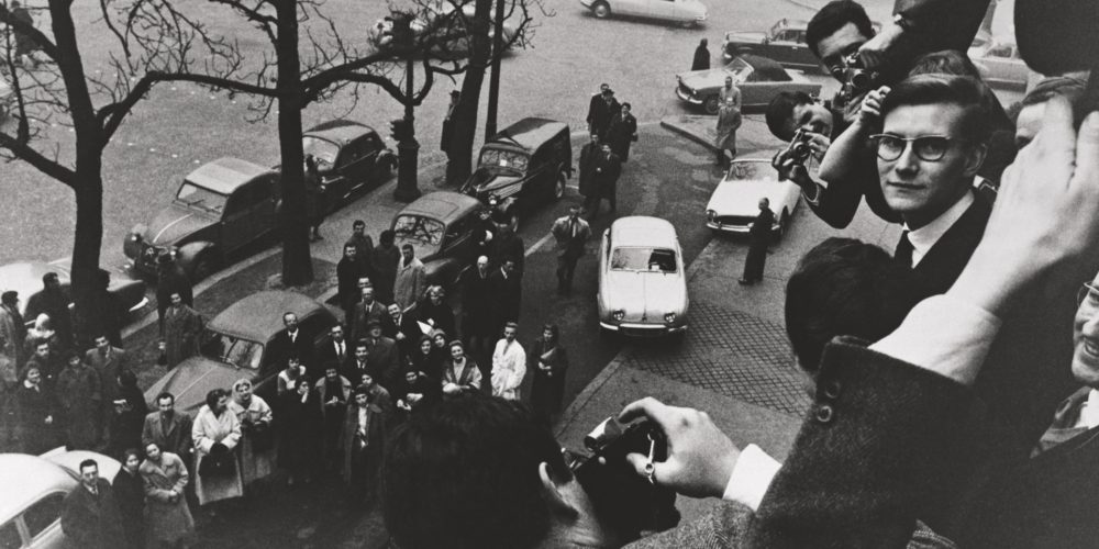
It's no small wonder that YSL was picked up by Dior to work in his studio during the haydays of Parisian fashion. Paris and France were just recovering from the rape of the country from World War II, and Dior was a huge part of that recovery. When
Dior died way too early in 1957, he had already ordered that his house would be run by YSL, and he was appointed head designer at the youngest age of 21. The designs that came from those years at Dior were inspirational and forward-thinking, but alas when YSL was drafted to fight in Algeria, the ending wasn't well, and Dior fired YSL and hired Marc Bohan to take his place.
It's easy to see the gift and talent in his first collection for Dior, but it was the antithesis of what the House of Dior had made it's name with - the very close waist and hourglass silhouette. But YSL knew that there was a new silhouette and line and he
brought it to the house with great style. Remember 1956 is when Chanel debuted her famous quilted jacket. There was a totally new movement afoot, and YSL had nailed it.
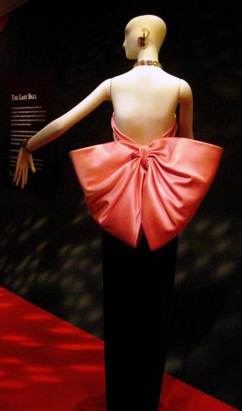
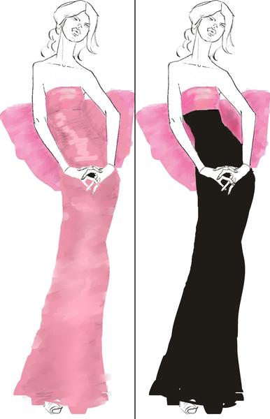
Later YSL would debut this beautiful classic gown, and there's a lot more to this than simply a nice bow. YSL knew exactly what he was doing and even better had solved a huge problem in doing this design.
The true fact is that this bow can be a terrible challenge. If the dress were all black or pink, the silhouette would be lost, and this would be nothing but a big pink blob around the middle of a model's most prominent features. Making the bow in high
contrast to the gown works beautifully, and the solution looks so effortless that it belies all the work that went into making this gown work. This gown has three prominent features - shoulders, bust, and silhouette. You take the silhouette away, and you have a strapless blob.
YSL talked about the seven accent points of a woman's body:
- Shoulders
- Bust
- Waist
- Hips
- Legs
- Back
- Silhouette
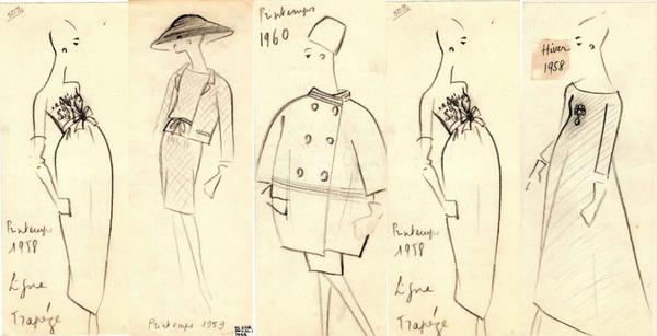
Seems easy doesn't it, but the problem comes in applying it. YSL said that if you accentuate more than 2 or 3 in a garment, you get into a slutty zone! If you do none, you're in a sloppy zone. For good examples of each, here's a quick document I wrote that shows each accent point really well.
The best way to start is to look at those seven points and figure out which one is your favorite, or you like the most, and start with that one, then the second fav. Go all the way down the list with your least fav at the bottom. That gives you a huge start on
how to design your garment with at least the top one, and maybe a little of #2 and #3, but not below that. This may seem like a tedious or
boring way to design, but it actually leaves you a huge amount of place to play with.
These three dresses are charming, and looks like a blast to swirl around in and wear. And the jackets aren't bad, but there's one that's really WOW and the others are just so. Why? Because the dress is loose and flowing, to contrast that, you
need a part of the body that is close and fitted without exposing bulges - one of the tops does that. It's most likely a stretch which means it's comfortable. So this gals has this flowing skirt and then this shaped top and it looks fabulous - a sweet meeting of comfort and fit.
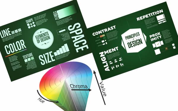
Another group of guidelines to use are the Elements and Principles of Design and
Color. Color is actually an Element, but it's so important that I include it as a separate element. I've seen color alone make or break an outfit even if the line, size, texture, and shape are all off.
The Elements of Design are the components of what makes a work of art work, while the Principles of Design are the guidelines for using the Elements. It looks like a bunch of complicated hooey, artsy-fartsy stuff, but they are so handy to know when you
think something is off and can't figure out why.
The important thing to remember here is that the fit, fashion, and style have to be flattering. I don't care if the style is in or out - if it isn't flattering, you look like a joke or parody of how you
want to present yourself to the world. I'm all about bringing out the positive and not being a fashion victim or frumpy because you're "over the hill" - whatever that means these days!
This is fairly easy. Be honest with yourself, and not put yourself in RTW
mode. You get to do this just the way you want. Now, that doesn't mean you're going to have some adjustment. Your clothes shouldn't fit like you have nothing on. That's not the purpose. IOW, if you're looking for a winter garment that will keep you warm, but you don't want any weight on your shoulders, well, let me break this to you easy - NO, that ain't gerna happen! So be realistic about your fit. I think
pants are the hardest, but once you get that fit, trace off that pattern and keep it forever - yes, forever - no matter what size you are. What you've done with that pattern is hit the shape, line and style you like. If you gain or lose weight, it will be within that same line that you have now that was given to you by your genes. That won't change. Adding a little on the sides or center front/back will usually make that pattern work.
But within the bounds of the limits of fabric, weight and design, you will come upon a look that works well for you. Comfort comes down to knowing your body and what looks good. So here are some quick looks and why they work and why they don't and
hopefully this can help you narrow down what works for you.
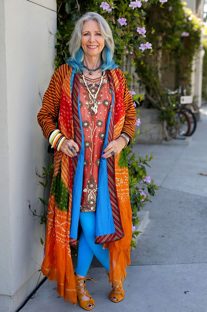
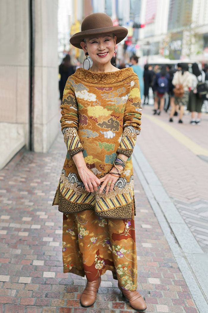
Wow! What a great look - let's take this apart. From the top - shoulders raglan, not my favorite but the stripe works - it's horizontal (except at the top where it's vertical). A long tunic over a shorter tunic with a lining same color as the leggings.
There's a pop of projecting color (the jade) with orange (opposite on the color wheel of the jade) making up the majority of the composition. Where does your eye flow - around the neck (yeah, I'm not hot on the blue hair, but a nice soft scarf around the neck would be more practical), down the front and pop at the bottom - your eye is going up and down. This lady has large hips and yet she doesn't look fat, and she has a lot of fabric on her, which probably means she comfy,
because your eye travels up and down. It's the pop/high-contrast that makes this outfit sing.
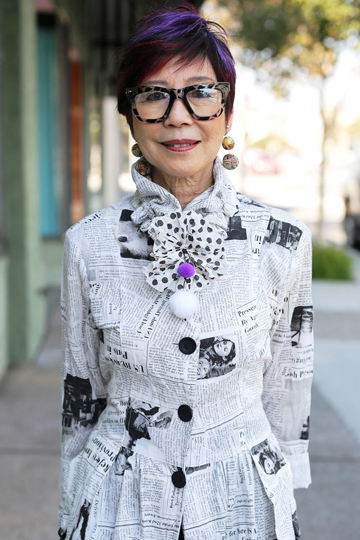
I love the whole line of this garment, but confession: This is for my size and shape. This is a pear but with the nice nip at the waist and attention to detail around the neck, it works. I'm not much on the hair color, but it's something that
stylists seem to think is necessary. It's not. This lady would look just as good w/o the purple hair a la Mrs. Slocum from Are You Being Served? Shoulders are neat, on point, hangs well from the shoulder; color is strict complementary (black and white); great collar/bow detail; and a little tiny ruffle/gathering just below the
hip to make for some great movement (and my bet is there are some pockets tucked into those gathering parts).
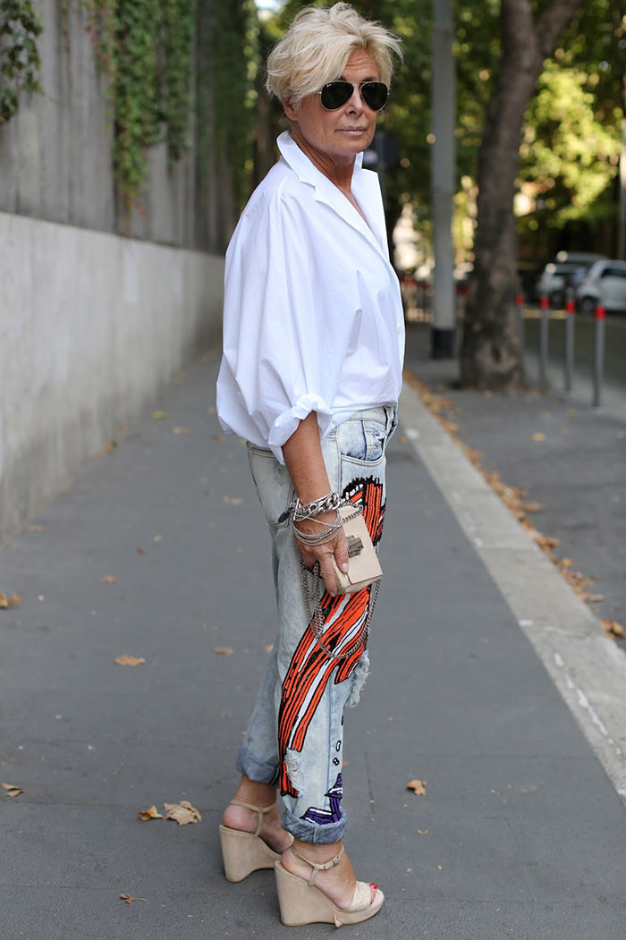
This is a great look and works for Apples and Rectangles and yes you heard that right. Usually this shape has to wear dark tops, but what makes this work is the short waist. I'm not nuts about all the gathering here, but if this were crop-esque (where
the bottom is more tailored and contained), it would be a knock-out. It shows how versatile and essential and white blouse is in everyone's wardrobe.
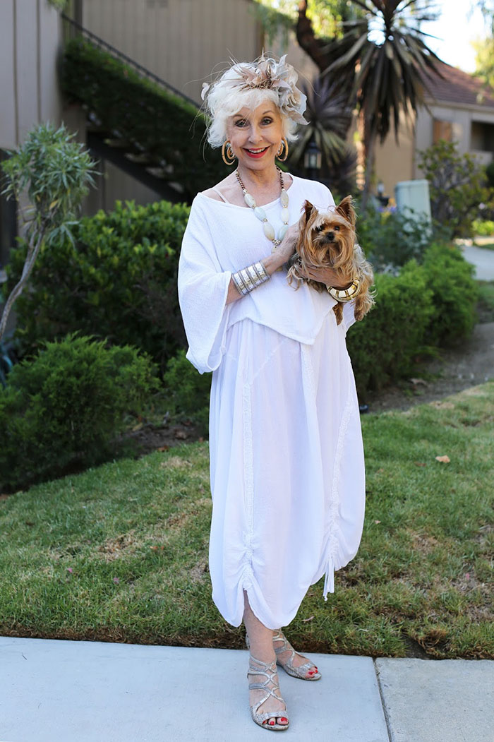
This works but because of some very unusual reasons. There's a stance issue here. IOW, if she stood straight, this would look like a bag (don't worry more bags are coming), but because she has the dog and her arm at her waist, it makes her waist look
smaller. That means you have the shoulder and waist accentuated here and that's enough. The truth is, once the dog is on a leash and off her arm, and her arms are straight, it's a bag. This is a lesson on bait and switch - looks ok, but it's really not.
Really stunning, but again there's some tricky photography going on here. What's good is that there's the up and down of the same color (fabric in this case) that gives this whole look an elongation feel. The other thing that makes this work is the
shadowing or silhouetting of the legs.
So They are working on a great premise here, but it's just that the pants look so much better than the long skirt, and the ONLY reason the long skirt works is because of the silhouetting of the legs.
This makes a point that's worth tackling here:
that pants are a key component to making things look trimmer than we think. Our eye is trained these days (in current fashion mode) to see that space between the legs as a delineation of bulk or no bulk. That means that if that space is not clearly dileneated (as in the silhouetting of the skirt), then the look will be frumpy.
The rest of the outfit - the top is fabulous...the collar is good, and this means we
have the shoulders and legs as accentuation points and it works.
This is just simple and elegant. Sleek with shape but not tight or TMI. And you can see why - see the shoulders are great on this - right on point, and the seam line - that princess seam from the shoulder to the hem - it's a couture designers main
weapon when he gets in a grande dame type figure that isn't like the skeletons on the runway. I love the collar which puts all the attention around the shoulders - and that the shoulders are hanging right is good too. Then the button is great - more attention at the face where you want the attention to flow. I would have liked to have seen this close straight in front which isn't that hard to do with princess seams, and the cuffs need to be shortened just a tad to keep it from
looking like she had to buy 5 sizes too big to fit her shoulders.
This is on a thin model, but it will work on a large or more normal figure. The pant leg stripe is the key. This has those excellent elements and principles of design used to the hilt. There's a nice hang from the shoulder, a little crop at the
waist, and the long tunic to accentuate the long stripe of the pants further. This shows what you can do with the elements and principles of design.
Both these gals are using lengthening techniques to keep your eye moving up and down - on the left is the knee-length tunic open so that the under dress shows and you see the line of the center front of the tunic. Black pants are always a friend for
anything. I would like to see a long light-colored scarf around the neck of the gal on the right to further that up and down look.
It's not always easy adjusting and working to flatter a shape that doesn't look like
the runway model, but there are some important things to remember.
This is too thin and not healthy and not normal. There is a lot wrong with this.
And there is a world of problems with this. We all know that! There is a sweet spot, and once you find that silhouette and that line that works for you, you can use it repeatedly. It becomes such a part of your wardrobe (because it works so well in various fabrics and colors), that you can even fool yourself. Certainly, those close to you will believe that you have an excellent
figure because you encompass that outstanding balance between style/fashion and comfort. It's worth the effort because once you have that pattern or set of patterns, it's incredible how easy this is to accomplish. This may sound like a challenging quest, but it's so worth it, and hopefully, the ideas above can help you and inspire you to tackle this trek!
The SewingArtistry Resource Library is designed to contain information to not only make your sewing better, but to aid in you fitting and flattering your shape, size and style. Check it out.
Look for future classes coming in 2024
The Core Pattern Shirt, (one of my favorites for woven core pattern that you can make into a myriad of different
garments),
Basic Knit Top (core pattern class for knit basic tops, shells, tees, dresses, and tunics)
|
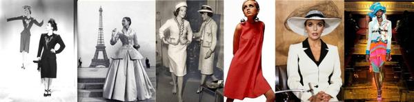
Tracking a fashion trend isn't all that hard after seeing a few of them.
Living from Mid-Century Modern through Twiggy...
It's worth the time to look at these styles, particularly today as
there is a group of that wants to look....
This is the way fashion used to be -- pretty, flattering and I can't wait to make some of...
NOTE: There are some folks who can't get my email, or it's sporadic, or something is hinky. I will always respond to any of you who send a private message, whether it's about the topic of the week or something else. If you don't get anything
from me, it's probably because the [email protected] email is blocked, and even a private message can't get through. In that case, I'm on Instagram often, and you can always PM me at @sewingartistry.
As a precaution,
please ensure I'm in your email Address Book and check your spam, junk, and trash folders. Some email clients get extra excited when they see emails coming into the Inbox that go to many other receivers. They automatically think it's trash or spam, and it never makes it to the Inbox. I must constantly check my spam and junk folders to ensure I'm getting the emails I subscribe to.
To view in browser along with past emails, click here. We respect your email privacy. |
|
|